CrUX Report Dashboard
Learn how to use the Knfrmd CrUX Dashboard to analyze website performance metrics and gain insights on improving web experiences.

How to Use The Knfrmd CrUX Report Dashboard
Welcome to the Knfrmd CrUX Dashboard. This guide will walk you through the steps to effectively utilize the dashboard and understand its metrics.
Step 1: Accessing the Dashboard
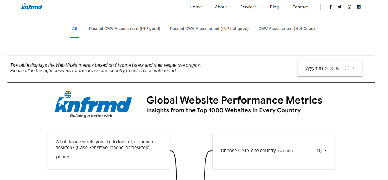
Open your web browser and go to the CrUX | Knfrmd - Web Consulting Dashboard.
Step 2: Selecting the Date Range
Click the dropdown arrow to choose the date range you want to work with. This helps in comparing the performance over different periods.
Step 3: Filtering by Device
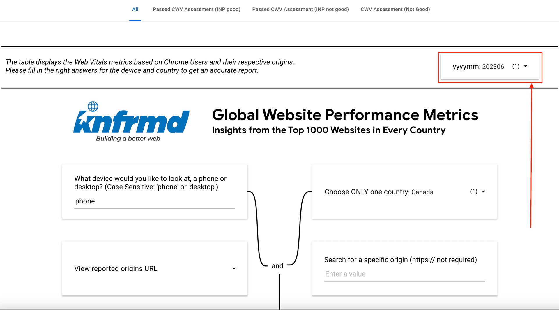
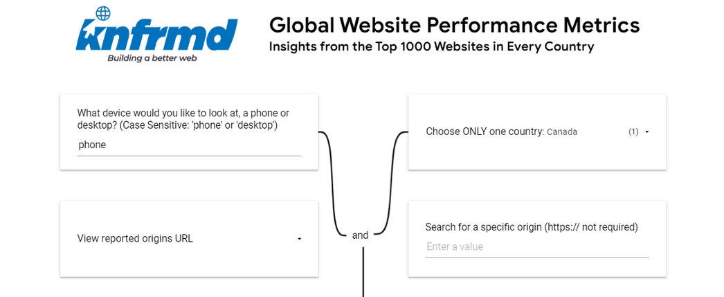
Type in the device you would like to analyze, such as 'phone' or 'desktop'. This will provide device-specific insights.
Step 4: Filtering by Country
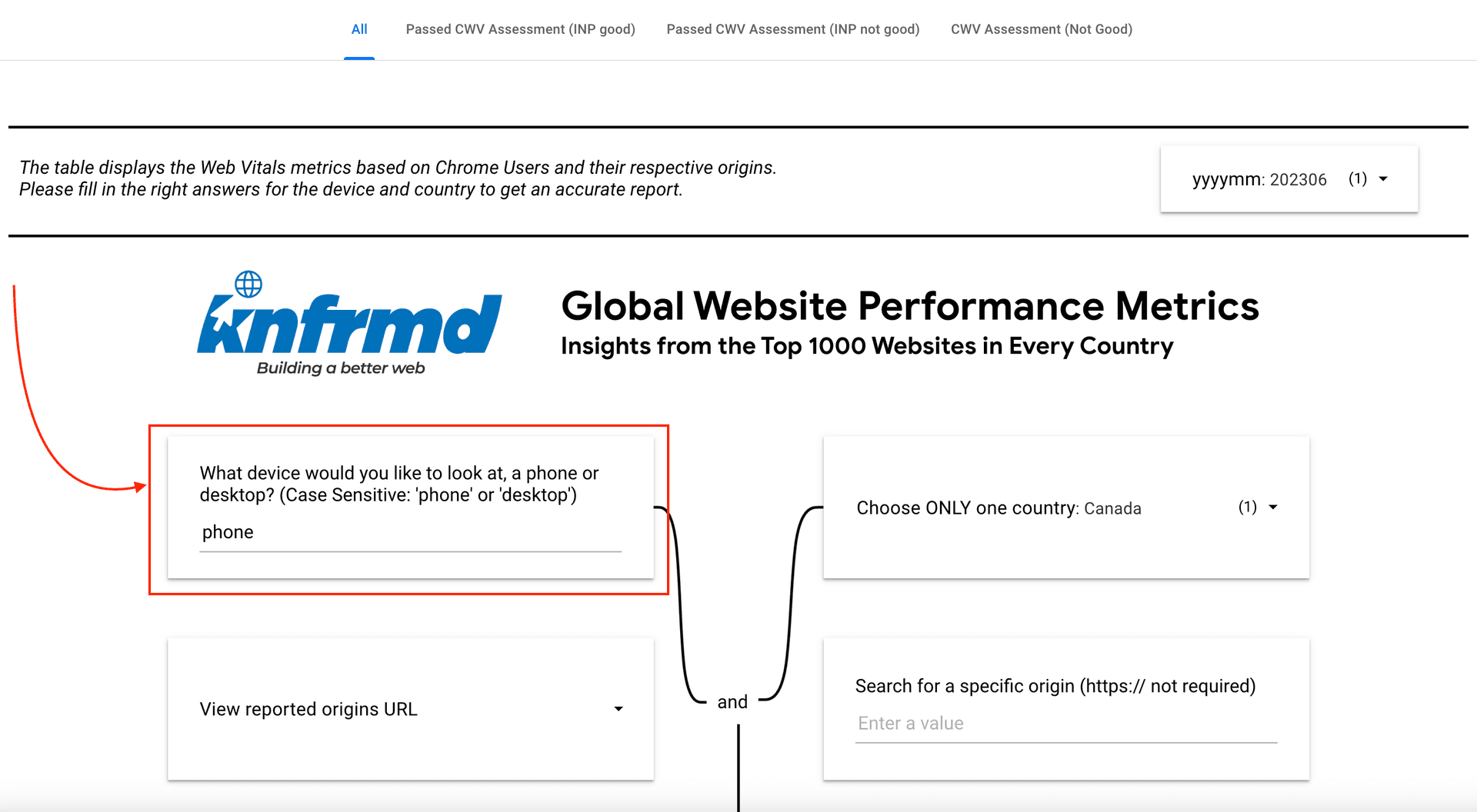
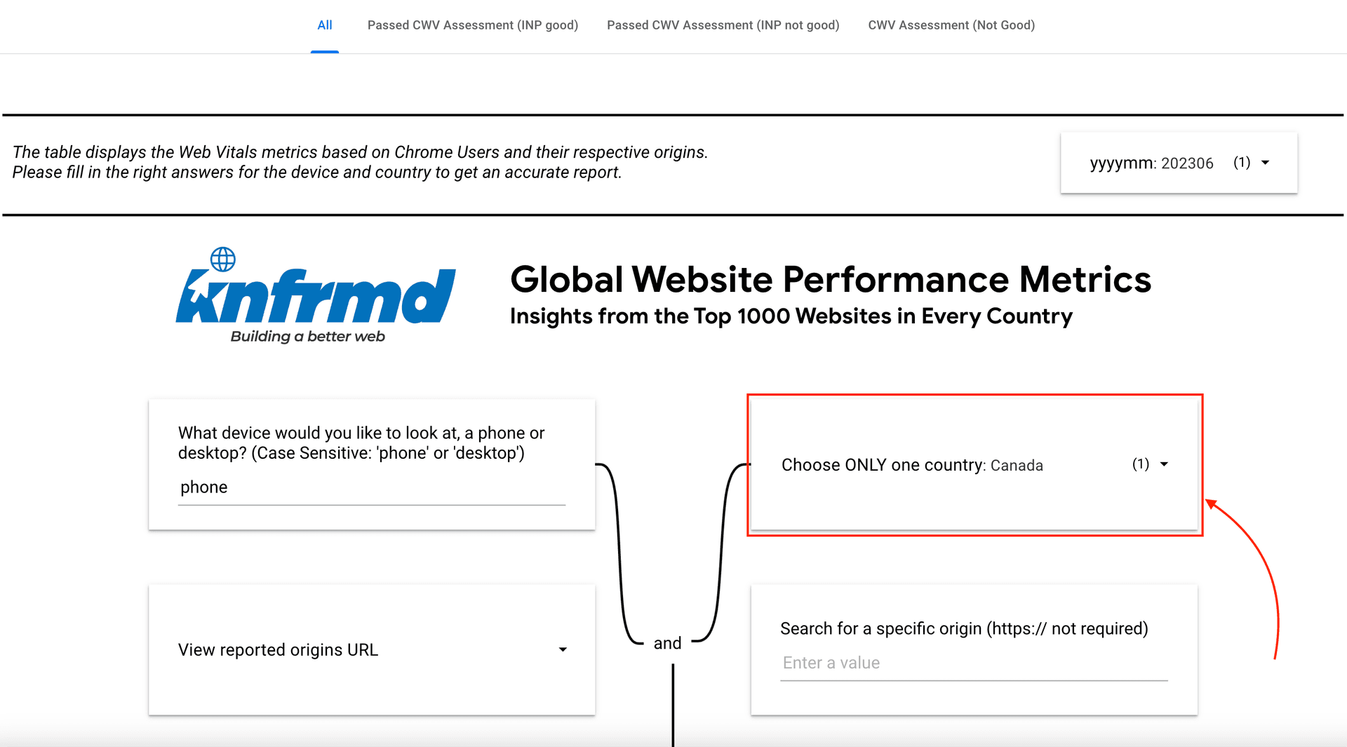
Click the drop-down arrow and select the country you want to focus on. You can choose one or more countries to refine your search.
Step 5: Filling Out All Fields
Ensure you have filled out all relevant fields to refine your search. This will help in displaying the results accurately.
Step 6: Displaying the Results
After completing the steps above, the dashboard will display the results based on your selected criteria. You can then analyze these metrics to understand your web performance.
Metrics and Tabs
Each metric provides a unique insight into your website's performance. The following are some of the key metrics tracked in the CrUX Dashboard:
- TTFB (Time to First Byte): Measures the time taken to receive the first byte from the server. Indicates server responsiveness.
- FCP (First Contentful Paint): Measures when the first content appears on the screen.
- INP (Interaction to Next Paint): Tracks responsiveness throughout the user’s interactions.
- LCP (Largest Contentful Paint): Marks the loading of the largest content element on the page.
- CLS (Cumulative Layout Shift): Quantifies unexpected shifts in layout during page load.
Color Indicators
Use the following color indicators to interpret the performance results:
- Green: Good
- Orange: Needs Improvement
- Red: Should be Improved
Conclusion
By following these steps and understanding the metrics and color indicators, you can effectively use the CrUX Report Dashboard to analyze web performance and make necessary improvements. This will help ensure your site delivers an optimal user experience.